
The Japanese Language Proficiency Test (JLPT) is the most recognized Japanese language examination and it is often a requirement for international students and workers to apply for jobs in Japan.
This project extractes the number of test takers of the JLPT from a series of PDF files and performed basic exploratory analysis using matplotlib and Tableau. One of the goals of this work was to test pdfplumber - a Python library specifically built to extract data from PDF.
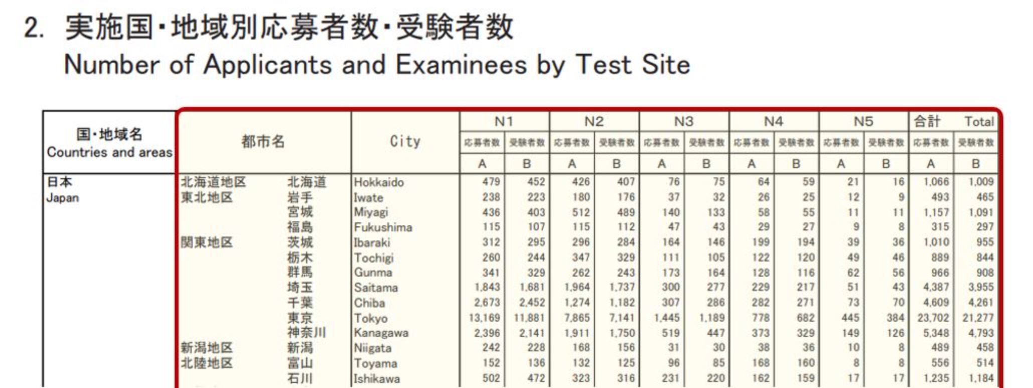
Data Extraction: The data covers December examinations from 2010 to 2019 and was originally stored into several PDFs. I set a for loop that and use the pdfplumber library to open each of the PDFs and grab the exact table I needed. After some trial and error, I managed to get the data within the red frame shown below:
Data Processing and Geocoding: Data extracted is stored into several lists. I write some lines of code to store those into a dataframe in a format that is easier for analysis. After that, I add some columns with growth rates and conduct geocoding using the arcgis API to get the latitude and longitude of the test centers. As for geocoding, some cities had ambiguous names; for example, there are two locations called “Kochi” in the world - one in Japan and another in India. I visualized the geocoded cities into a map and wrote additional code to account for the cases I was able to spot.
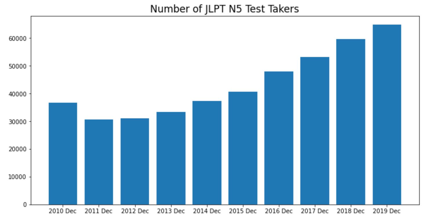
Visualize with Matplotlib: Before importing the data into a Tableau file, I built some quick visualizations in matplotlib to get an idea of what kind of data I was working with. For example, the chart below shows that N5 test takers (beginner level) are consistently growing since 2012. In other words, there is a demand for Japanese education.
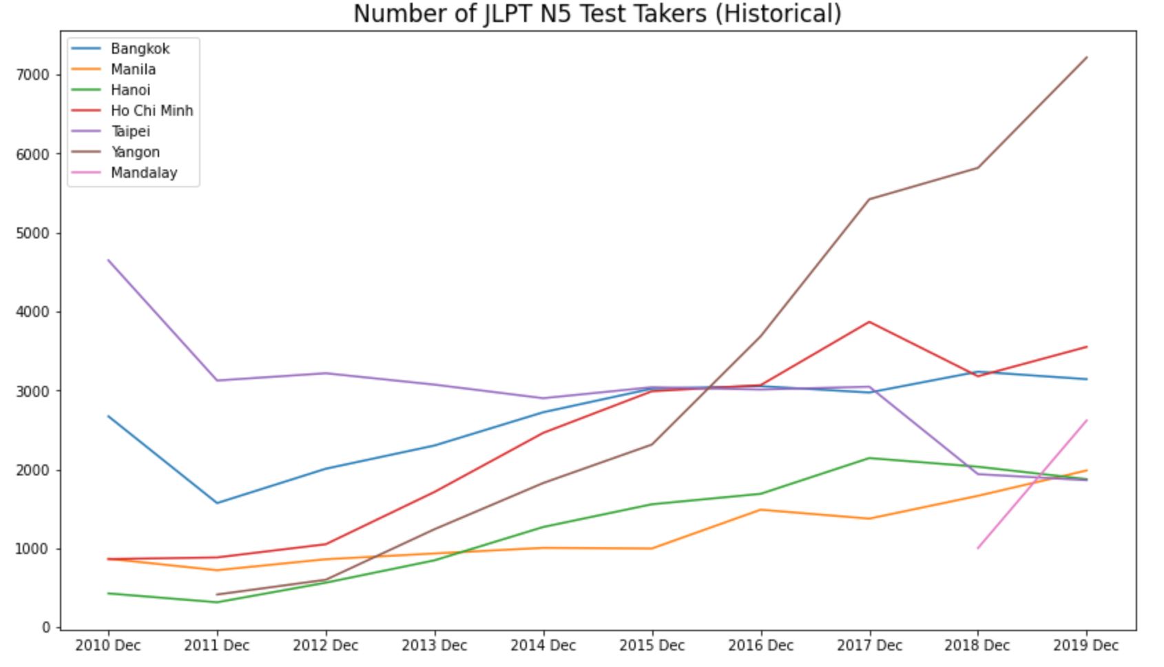
Looking at the historical trends of the top cities in number of N5 test takers, we see that Yangoon (Myanmar) has seen an explosion in number of Japanese language test takers. I sense that there might be some sort of government scheme to mass import workers from Myanmar to join the Japanese labor market in the near future.
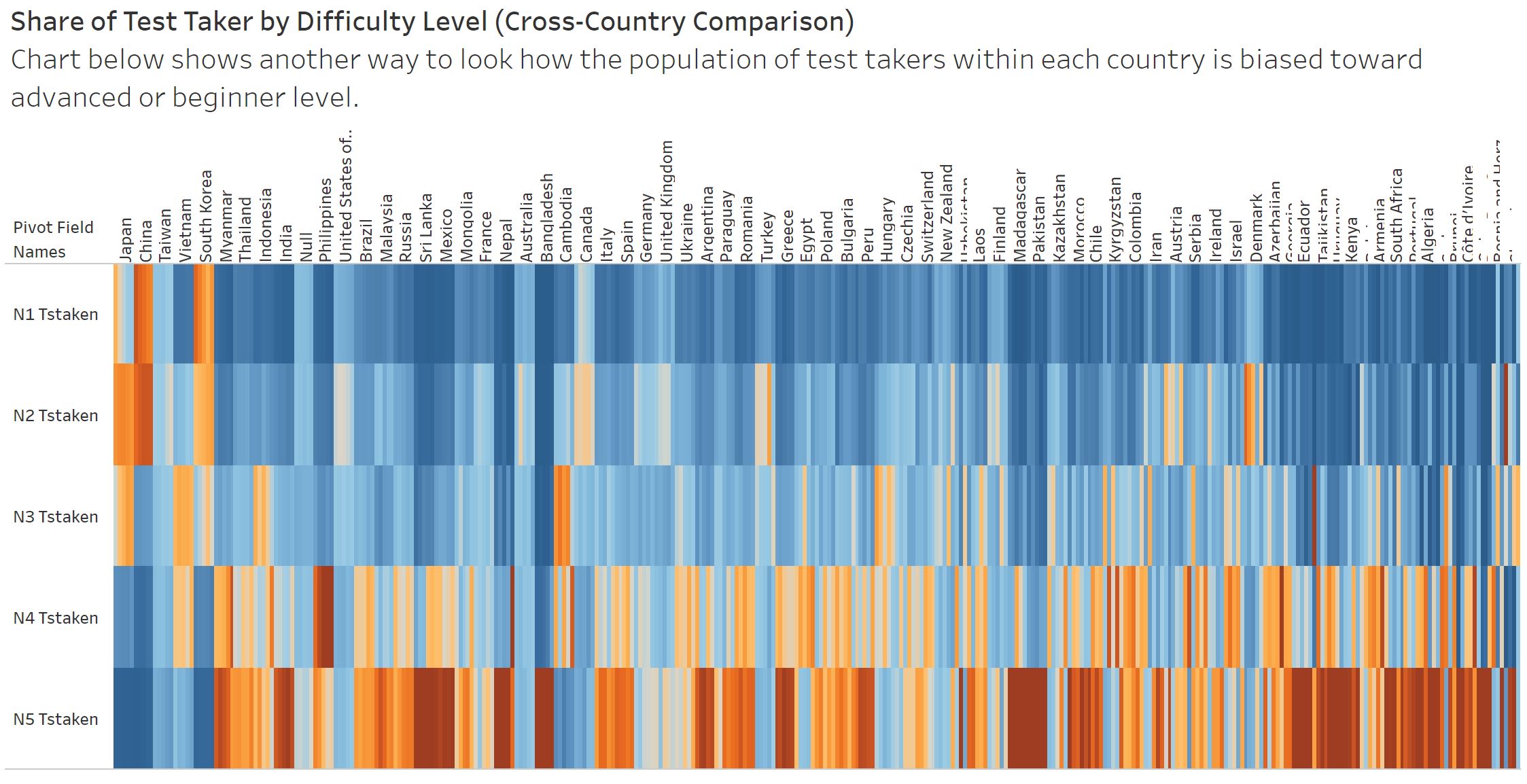
Visualize in Tableau: Final step is to import the data into Tableau. I built a sequence of charts that highlights the main insights of the analysis. For example, as I expected, we see that most test takers come from Asia. Also, that the share of advanced level (N1) test takers are higher in Japan, China, and South Korea. See the complete Tableau output here.
Wrap-up: In this project I learned how to use pdfplumber and performed some analysis on the worldwide demand for Japanese language education. Results showed that, for some reason, the number of beginner level test takers in Yangoon (Myanmar) is growing very fast compared to other countries, which suggests that there might be some policymaking driving this somewhat unnatural trend.
An interesting topic for further analysis would be to try to estimate the loss in the number of test takers during the years of 2020 and 2021 - period affected by the restrictions imposed by the COVID-19 pandemic. One method would be to conduct a time series or panel analysis and compare forecasted results with actual figures.