
In this project, I use a dataset of United Nations General Assembly resolutions to understand voting patterns. For example, do liberal democracies vote together? Is there real coordination among oil producing countries? What about former soviet / socialist countries? After processing the data, I use K-Means clustering to see if I these well known political alliances appear in data and apply dimensionality reduction to get a nice scatter plot.
Data Processing: The data covers resolutions passed from 1946-2020 (about 5700 resolutions) and the vote of each member state is recorded in different rows which makes the dataset quite large (more than 1M rows). I decided to remove resolutions that were too old (before 2000) and also resolutions that I thought were not “contentious” enough. Say, for example, that a voting session was held to discuss the “right to food” or the “right to clean water”. These are more like symbolic resolutions and were extremely skewed toward the “yes” vote.
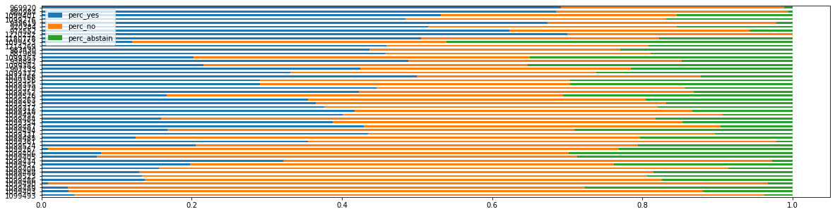
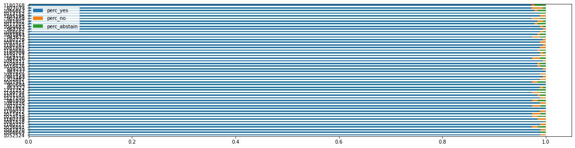
After sorting resolutions based on the percentage of yes and no, it was clear that resolutions with higher percentage of “no” were the divisive ones that had the potential to shed light on the diplomatic alliances that this project was interested in. The image below shows the top 50 resolutions with large percentage “no” and below the top 50 resolutions with high percentage of “yes”.
Before proceeding to the clustering work, I noticed that some countries had a lot of NaNs. These were recent added UN member states such as East Timor (independence in 2002) and South Sudan (independence in 2011). I decided to remove South Sudan as there was not enough voting data for it.
K-Means Clustering: A central issue when running a K-means is the number of clusters K that the analyst needs to input as a paramater of the algorithm. In a case where we don’t know how many clusters there will be in the data, it is good practice to input multiple values for K and check how the elbow curve behaves. The best K would be the K where the curve stops diminishing and becomes almost flat. For this particular case, based on my previous knowledge of international affairs (I happened to have been majored in international politics), I expected to find a couple of well defined clusters, so I don’t do the elbow curve analysis. Here are the three main clusters I expected to find: one with countries closely aligned with US interests (basically G7 countries), another aligned with Russia/China interests, and another cluster with a mix of countries not particularly aligned to a single superpower.
Dimensionality Reduction with PCA: In order to show the clustering results into a 2 dimensional plot, I also perform dimensionality reduction using the PCA algorithm. PCA will look into the variance of each feature, perform linear transformations to the data and produce a n-dimension dataset (2 for this project) that best summarizes the original dataset. The data science literature says that reducing the dimensionality helps to generate better clustering results because it reduces the effect of irrelavant features. I don’t have a formal way to test this, but based on my previous knowledge of international affairs, it seems to me that PCA has indeed made results look better for this project. See below the clusters I got after running PCA and the K-means clustering.
-
Cluster 1: [‘Antigua and Barbuda’ ‘Armenia’ ‘Azerbaijan’ ‘Benin’ ‘Bhutan’ ‘Botswana’ ‘Burkina Faso’ ‘Georgia’ ‘Ghana’ ‘Guinea’ ‘Haiti’ ‘Kazakhstan’ ‘Laos’ ‘Lesotho’ ‘Maldives’ ‘Mali’ ‘Mauritania’ ‘Mongolia’ ‘Mozambique’ ‘Rwanda’ ‘Saint Lucia’ ‘Saint Vincent and the Grenadines’ ‘Switzerland’ ‘Tanzania’ ‘Togo’ ‘Trinidad and Tobago’ ‘Zambia’]
-
Cluster 2: [‘Central African Republic’ ‘Guinea Bissau’ ‘Kiribati’ ‘Liberia’ ‘Saint Kitts and Nevis’ ‘Sao Tome and Principe’ ‘Seychelles’ ‘Tonga’ ‘Tuvalu’]
-
Cluster 3: [‘Albania’ ‘Andorra’ ‘Australia’ ‘Austria’ ‘Belgium’ ‘Belize’ ‘Bosnia and Herzegovina’ ‘Bulgaria’ ‘Canada’ ‘Croatia’ ‘Cyprus’ ‘Czech Republic’ ‘Denmark’ ‘Estonia’ ‘Finland’ ‘France’ ‘Germany’ ‘Greece’ ‘Hungary’ ‘Iceland’ ‘Ireland’ ‘Israel’ ‘Italy’ ‘Japan’ ‘Latvia’ ‘Liechtenstein’ ‘Lithuania’ ‘Luxembourg’ ‘Malta’ ‘Monaco’ ‘Netherlands’ ‘New Zealand’ ‘Norway’ ‘Poland’ ‘Portugal’ ‘Romania’ ‘Samoa’ ‘San Marino’ ‘Slovakia’ ‘Slovenia’ ‘South Korea’ ‘Spain’ ‘Sweden’ ‘UK’ ‘USA’ ‘Ukraine’]
-
Cluster 4: [‘Afghanistan’ ‘Cambodia’ ‘Chad’ ‘Comoros’ ‘Congo’ ‘Equatorial Guinea’ ‘Gabon’ ‘Iraq’ ‘Kyrgyzstan’ ‘Madagascar’ ‘Niger’ ‘Somalia’ ‘Tajikistan’ ‘Turkey’ ‘Turkmenistan’ ‘Uzbekistan’]
-
Cluster 5: [‘Cabo Verde’ ‘Cameroon’ ‘DR Congo’ ‘Dominica’ ‘Fiji’ ‘Grenada’ ‘Malawi’ ‘Marshall Islands’ ‘Micronesia’ ‘Nauru’ ‘Palau’ ‘Papua New Guinea’ ‘Sierra Leone’ ‘Solomon Islands’ ‘Suriname’ ‘Timor-Leste’ ‘Vanuatu’]
-
Cluster 6: [‘Angola’ ‘Argentina’ ‘Bahamas’ ‘Barbados’ ‘Bolivia’ ‘Brazil’ ‘Burundi’ ‘Chile’ ‘Colombia’ ‘Costa Rica’ ‘Dominican Republic’ ‘Ecuador’ ‘El Salvador’ ‘Guatemala’ ‘Honduras’ ‘Mauritius’ ‘Mexico’ ‘Namibia’ ‘Nepal’ ‘Nicaragua’ ‘Panama’ ‘Paraguay’ ‘Peru’ ‘Philippines’ ‘Thailand’ ‘Uruguay’]
-
Cluster 7: [‘Algeria’ ‘Bahrain’ ‘Bangladesh’ ‘Belarus’ ‘Brunei Darussalam’ ‘China’ ‘Cuba’ “Côte D’Ivoire” ‘DPRK’ ‘Djibouti’ ‘Egypt’ ‘Eritrea’ ‘Ethiopia’ ‘Guyana’ ‘India’ ‘Indonesia’ ‘Iran’ ‘Jamaica’ ‘Jordan’ ‘Kenya’ ‘Kuwait’ ‘Lebanon’ ‘Malaysia’ ‘Morocco’ ‘Myanmar’ ‘Nigeria’ ‘Oman’ ‘Pakistan’ ‘Qatar’ ‘Russia’ ‘Saudi Arabia’ ‘Senegal’ ‘Singapore’ ‘South Africa’ ‘Sri Lanka’ ‘Sudan’ ‘Syria’ ‘Tunisia’ ‘UAE’ ‘Uganda’ ‘Venezuela’ ‘Viet Nam’]
Cluster 3 shows liberal democratic economies mostly closed aligned to US interests. Cluster 7 groups in countries more closely aligned to Russia/China and countries of Islam majority. It was interesting to see how Latin American countries were all included in Cluster 6 and Pacific island states mostly included in Cluster 5.
Visualize with Matplotlib: Last step is to visualize results in a nice 2D scatter plot. Now I can see how cluster 3 (liberal democratic advanced economies) has a lot of plots on top of each other! Seems like the voting patterns for these countries are very well aligned (put in another way, it is very easily predicatable).

In this project, I played around with the United Nations General Assembly resolution data. I experimented with the PCA algorithm and the K-means clustering and achieved results that were mostly in line with what I expected to find. It was indeed a very interesting exercise to use my data science skills to explore a topic that I used to read a lot about during my undergrad years. A trully interdisciplinary project!
- Check the ipynb notebook here